
By using this site, you agree to the Privacy Policy and Terms of Use.
Accept
Tech Consumer JournalTech Consumer JournalTech Consumer Journal
  • News
  • Phones
  • Tablets
  • Wearable
  • Home Tech
  • Streaming
  • More Articles
Reading: Instagram’s New Wordmark Couldn’t Be a Better Metaphor for Tech
Share
Sign In
Notification Show More
Font ResizerAa
Tech Consumer JournalTech Consumer Journal
Font ResizerAa
  • News
  • Phones
  • Tablets
  • Wearable
  • Home Tech
  • Streaming
  • More Articles
Search
  • News
  • Phones
  • Tablets
  • Wearable
  • Home Tech
  • Streaming
  • More Articles
Have an existing account? Sign In
Follow US
  • Contact
  • Blog
  • Complaint
  • Advertise
© 2022 Foxiz News Network. Ruby Design Company. All Rights Reserved.
Tech Consumer Journal > News > Instagram’s New Wordmark Couldn’t Be a Better Metaphor for Tech
News

Instagram’s New Wordmark Couldn’t Be a Better Metaphor for Tech

News Room
Last updated: August 15, 2026 12:29 pm
News Room
Share
SHARE

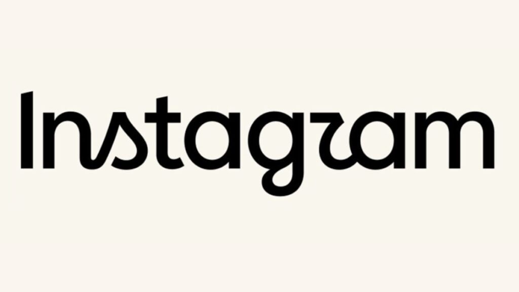
Instagram has a new logo wordmark. The new design was announced by Adam Mosseri —father of three boys, married to an amazing woman and, aw shucks, yeah, now that you mention it, head of Instagram —on his own account yesterday. Mosseri’s post described the revision as “cleaner and more modern, with references to the original and the simplicity and craft that’s always made it Instagram.” And boy, do people hate it.

I mean, where to begin? The most obvious place to start is with the glyph for the letter “r,” which looks like no lower case “r” that has ever existed before nor —if there is any mercy left in the world— any that will ever exist again. (It does, however, look strikingly like the lower case Greek letter τ; perhaps this is the Greek alphabet’s belated revenge for the inexplicable abuse it’s suffered at the hands of American fraternities and sororities over the years.)

Beyond the genuinely mystifying “r”, there’s so, so much else at which to shake one’s head here. There’s the jarring mixture of cursive and printing; the inexplicably jaunty little angled stroke at the top of the “I”; the rag-tag mixture of stroke weights; the fact that the “g” looks like the “a” with a nasty infection; and a million other things that I probably haven’t even noticed but are giving professional typographers aneurysms as we speak.

Ultimately, though, all those things are stylistic choices. They’re bad ones, to be clear—but they’re superficial. I’d argue that the real problem with the new wordmark is more fundamental and conceptual than those weird pieces of, um, design. The old wordmark is, at its most basic level, meant to recall human handwriting. It doesn’t actually look like handwriting, obviously, but that’s ultimately what these sorts of typefaces are often meant to evoke—a sort of folksy, hands-on charm. Instagram: it’s photography, it’s DIY, its name is written in a script font. You don’t have to like it, but there’s at least some measure of conceptual coherency to it.

The new version takes the old and… You know that thing that Preview (and no doubt Windows equivalents) does when you’re circling something on a document? When it “fixes” the rough, all-too-human scrawl you’ve added by converting it into a perfect ellipse? I guess there’s someone out there who doesn’t hit Cmd-Z as soon as this happens, and maybe they’re the same person who came up with this idea, because it’s essentially the same thing, but applied to a gazillion-dollar company’s branding. It takes something designed to evoke a feeling of humanity and… removes the feeling of humanity. It makes no sense…f

…

…but then, the more you think about it, the more sense it makes. For all Meta’s hilarious wait-are-we-the-bad-guys? energy, I can’t imagine that they set out here to arrive on a nice typographical embodiment of everything that big tech doesn’t understand about people. But that’s where they’ve landed: a wordmark takes the basic shapes of its predecessor’s glyphs and drains the last vestiges of anything remotely human from them. What’s left? Just the shapes themselves: cold, empty, hollow, nigh on illegible —and, if you look at them long enough, you see what’s really going on: they’re devolving slowly into the same typeface used for the Meta corporate wordmark.

Why yes, folks, it is a big metaphor for AI/enshittification/everything else: the internet, what should have been humanity’s greatest creation, just without the humans. If you want a picture of the future, imagine the color beige stamping on a human face—forever.


Read the full article here

You Might Also Like

‘Masturbation Consultants’ Gave an AI Startup a Hand

Data Centers Will Eat 12% of US Electricity by 2030. This Platinum Fuel Cell Fix May Help

Crocodiles Evolved Backwards From Warm-Blooded Species to Cold-Blooded Killers

Ancient Greek Elites May Have Forged Their Jewelry From Space Rocks

Disney Wants You to Behold the First ‘VisionQuest’ Trailer

Share This Article
Facebook Twitter Copy Link Print
Previous Article ‘Masturbation Consultants’ Gave an AI Startup a Hand
Leave a comment

Leave a Reply Cancel reply

Your email address will not be published. Required fields are marked *

Stay Connected

248.1kLike
69.1kFollow
134kPin
54.3kFollow

Latest News

The First Trailer for ‘Ahsoka’ Season 2 Is Finally Here
News
We Just Saw the First Footage From ‘Star Wars: Starfighter’
News
Doomsday’ Footage Is Officially Here
News
Here’s What the New ‘Avatar’ Land Looks Like
News
New Technique for Ruining Flock Cameras Just Dropped
News
Live Updates From Disney’s Mega Film and TV Panel at D23 2026 🔴
News
Your Sports Betting Is Obviously Illegal
News
Apple Wants to Settle Its Long-Running Legal Battle With Epic Games
News

You Might also Like

News

30 Years Later, ‘Cure’ Is Still an Unassailably Hypnotic Horror Masterwork

News Room News Room 6 Min Read
News

Google Opens the Gates of AI Slop Hell

News Room News Room 3 Min Read
News

‘Ahsoka’ Season 2 Sure Seems Like It’s Going Back to ‘The Clone Wars’

News Room News Room 3 Min Read
Tech Consumer JournalTech Consumer Journal
Follow US
2024 © Prices.com LLC. All Rights Reserved.
  • Privacy Policy
  • Terms of use
  • For Advertisers
  • Contact
Welcome Back!

Sign in to your account

Username or Email Address
Password

Lost your password?